New Town Bakery
Branding
Case Study

Spring 2024
Background
New Town Bakery is a family-run shop specializing in Chinese and Filipino baked goods, serving Vancouver since 1980 from its original location in Chinatown.
The Challenge
Redesign the identity of an Asian family bakery to attract new customers and blend with its surroundings—while preserving the essence that loyal customers cherish.
The Strategy
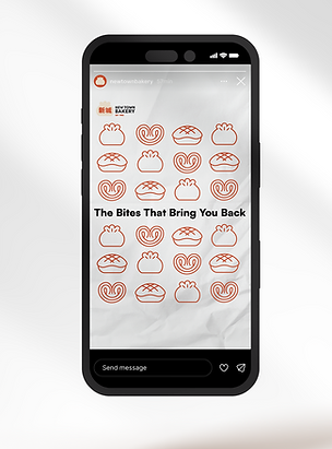
New Town Bakery’s rebrand refreshes its identity for new generations while preserving its nostalgic charm. Inspired by my own childhood visits,
I created the tagline “The Bite That Brings You Back”—a line that evokes cherished memories for loyal customers and invites new ones to feel instantly at home.

The Solution
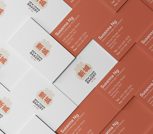
This rebrand captures a clean yet nostalgic tone, updating New Town Bakery’s look while honoring its cultural roots. The palette shifts to a symbolic red-orange, with a logo featuring “新城” and a steamed bun illustration in a stamp format for flexible use. Signature items like pineapple buns and butterfly cookies were illustrated as stickers and monoline artwork for packaging and marketing. To add warmth, I hand-lettered “Jenny’s Favorites” in English and Traditional Chinese, creating a personal touch that feels both heartfelt and familiar.