Cora
Branding
Case Study

Fall 2023
Background
Cora Breakfast and Lunch, a Canadian favorite since 1987, is known for fresh, healthy, and beautifully presented dishes. Celebrating the importance of breakfast, we serve vibrant meals in a warm, family-friendly atmosphere.
The Challenge
Create a new identity that better serves the client, accompanied by a graphic standards booklet and supporting assets.
The Strategy
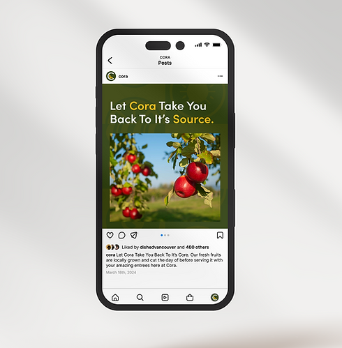
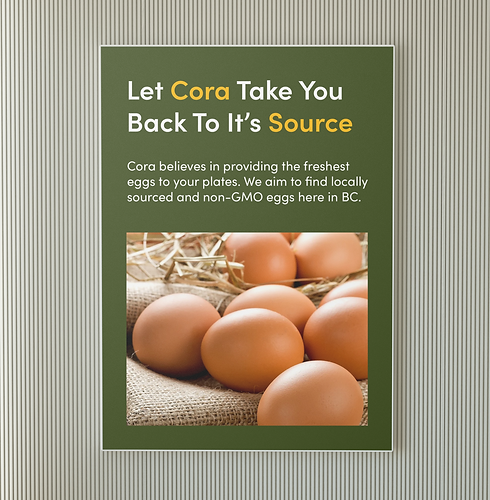
Cora Breakfast and Lunch, a beloved Canadian chain, is known for its vibrant, fruit-filled breakfasts and warm, family-friendly atmosphere. The rebrand focused on celebrating Cora’s commitment to high-quality ingredients and the joy of starting the day right. Central to this was the new tagline—“Let Cora Take You Back to Its Source”—a nod to the wholesome produce and beautifully presented dishes that have made the brand a staple for generations.


The Solution
The redesigned Cora logo pairs the name with “Breakfast + Lunch,” with the “C” stylized as an orange slice to highlight the brand’s focus on fruit and nutrition. A refreshed palette introduces a deeper green with black and white for contrast, appealing to a broader audience. Geometric illustrations of eggs, bacon, fruit, and cutlery extend across brand assets, including a custom pattern, keeping the identity fresh, simple, and true to Cora’s essence.